
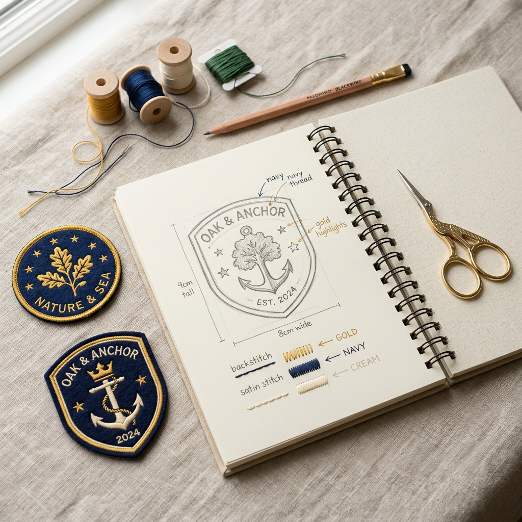
Most people figuring out how to design a custom patch aren’t professional designers — they’re a coach, a small business owner, a school rep, or someone planning a family reunion. The good news is you don’t need design experience to get a great result. You just need to know what decisions actually matter before you send your idea to a manufacturer, because a handful of small choices made early on are what separate a patch that looks exactly like you imagined from one that needs a costly redo.
Here are the 7 steps that make the biggest difference.
1. Start With a Clear Idea, Not Finished Artwork
You don’t need a polished file to begin. A hand-drawn sketch, a written description, or even a reference photo pulled from somewhere else is enough to start the conversation. Manufacturers who offer free mockups — which most reputable custom patch companies do — will turn your rough idea into proper artwork as part of the quoting process. Don’t let “I’m not a designer” stop you from starting; that part of the process is usually handled for you at no extra cost. This is often the hardest part of learning how to design a custom patch — knowing where to start
2. Pick the Right Patch Type for Your Design
This is the first real design decision, and it’s the one most people get wrong without realizing it. Embroidered patches suit bold logos and thick text, giving a textured, traditional look. Woven patches handle small text and fine detail better, since the weave is tighter than embroidery thread allows. PVC works well for bright, bold color and holds up outdoors. Chenille gives a raised, varsity-style look best suited to large lettering and numbers. Sublimated patches allow full-color, photo-realistic designs with gradients that thread-based methods simply can’t reproduce.If you are learning how to design custom patches, start with a clear logo and limit your colors to 3 to 5.
Choosing the wrong technique for your artwork — say, cramming fine detail into an embroidered patch — is the single most common design mistake, and it’s an easy one to avoid once you know the differences.
3. Simplify Your Color Palette
By now you should have a clearer picture of how to design a custom patch that actually works in production, not just on screen. Fewer colors almost always look cleaner and cost less to produce, especially for embroidered and PVC patches, where each color typically means a separate thread change or tooling step. Aim for somewhere in the range of 4 to 8 colors where possible. If your logo has gradients, shading, or dozens of subtle shades, that’s usually a sign you’ll get a better result from sublimation rather than trying to force it into embroidery or PVC.
4. Choose a Size That Matches Where It’s Going
A patch that looks perfectly proportioned on a screen can feel oversized on a small cap or too small on the back of a jacket. As a rough guide: 2 to 3 inches works well for caps and small items, 3 to 4 inches suits chest placement on shirts and jackets, and 4 inches or larger is typical for jacket backs or standalone statement pieces. If you’re not sure, ask your manufacturer for a size comparison against a real garment in your mockup rather than guessing from dimensions alone.
5. Think About Text Legibility Early
Small text is one of the biggest risk areas when learning how to design a custom patch. What reads clearly on a screen can blur, fill in, or become illegible once it’s actually stitched — this happens especially often with embroidery, where thread has physical width that thin letterforms can’t always hold. If your design includes fine print, you have three options: enlarge the text, simplify the font to something bolder, or switch to woven construction, which handles small detail far better than traditional embroidery.
6. Decide on Backing and Border Before You Finalize
Backing type — iron-on, sew-on, Velcro, or adhesive — and border style, such as merrowed or laser-cut edges, both affect not just how the patch attaches but how it looks once finished. Deciding these details upfront, rather than treating them as an afterthought once the artwork is done, means your mockup reflects the true final product rather than just a flat image of the design. It also avoids a second round of approvals later when you realize the backing you assumed wasn’t actually specified.
7. Always Review a Mockup Before Production
No matter how experienced you are, colors, proportions, and small text frequently look different once translated from a screen into thread, PVC, or dye. A free mockup gives you the chance to check every detail — spelling, colors, size, backing, border — against the real production method before a single patch is actually made. This single step prevents the vast majority of reorders, disappointment, and wasted budget, and it costs you nothing to ask for.
Common Mistakes to Avoid
- Using too many colors or subtle gradients in a design meant for embroidery, where thread simply can’t reproduce that level of nuance
- Sizing the patch based on how it looks on a screen rather than on the actual garment it’s going on
- Skipping the mockup step to “save time,” which often costs more time later in reorders
- Choosing iron-on backing for an item that will be washed frequently — for more on this, see our guide on [link this phrase to your iron-on vs sew-on blog post]: “iron-on vs sew-on patches”
- Assuming a manufacturer will “just know” what you want without specifying backing, border, and size clearly upfront
A Simple Way to Check Your Design Before You Order
If you’re unsure whether your current idea will translate well, ask yourself three questions: does the design have small text or fine detail, does it rely on gradients or many colors, and where exactly will the finished patch be placed? Your answers to these three questions point you toward the right patch type, the right color approach, and the right size — the three decisions that matter most in how to design a custom patch that turns out the way you pictured it.
Ready to Turn Your Idea Into a Patch?
You don’t need finished artwork to get started — just an idea, however rough. [Link this phrase to your Bulk Orders page: “Send us your design or sketch”] and we’ll handle the rest, including a free digital mockup so you can see exactly how it will look before you pay for anything. There’s no minimum order required, whether you need a handful of patches or a few thousand. That’s really all there is to how to design a custom patch the right way — start with an idea, and let the details get sorted out together.
2 Responses